ATELIER MERIDEM
SECTOR
Architecture
YEAR
2026
TYPE
Architectural Brand Identity
DELIVERABLES
Logo · Guidelines · Typography · Grid system
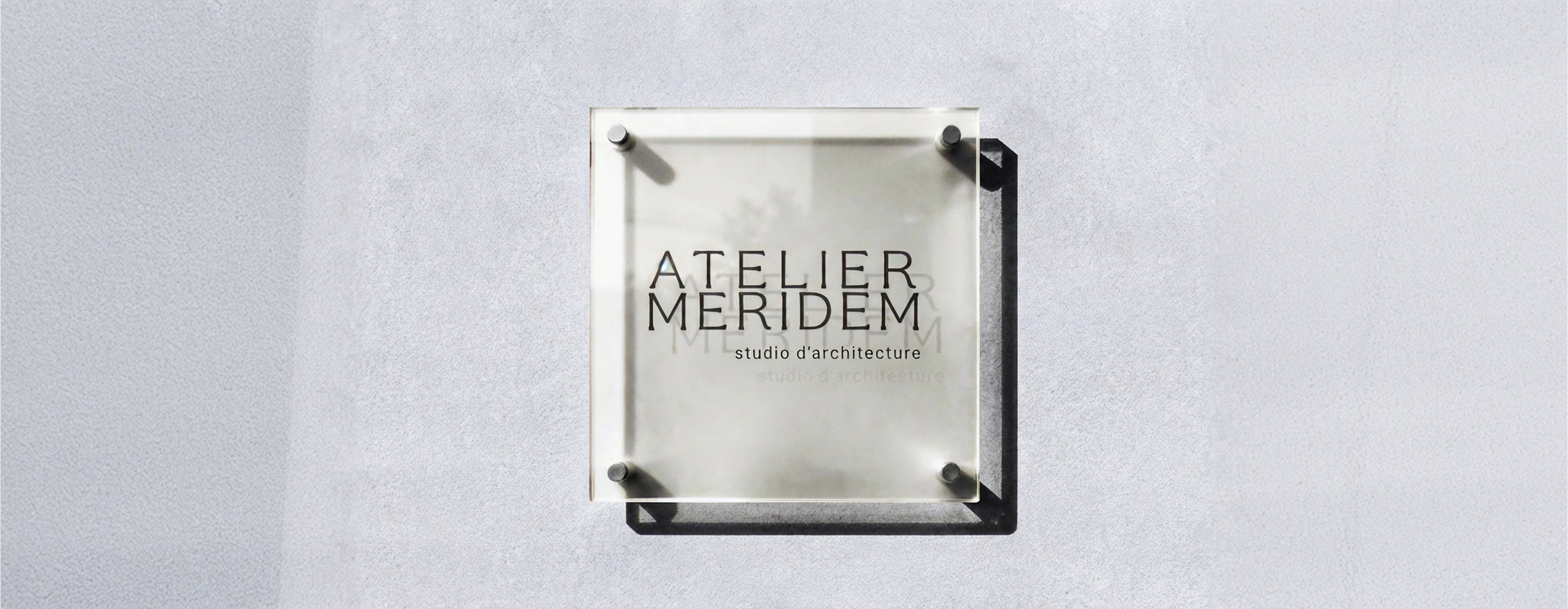
“A typographic brand system built for an architecture studio at the intersection of culture and precision.”
The identity was built on typographic architecture as the primary visual language. Precise, structured and deliberately restrained — every element communicates the same intelligence found in the studio's architectural practice.
How the system was built
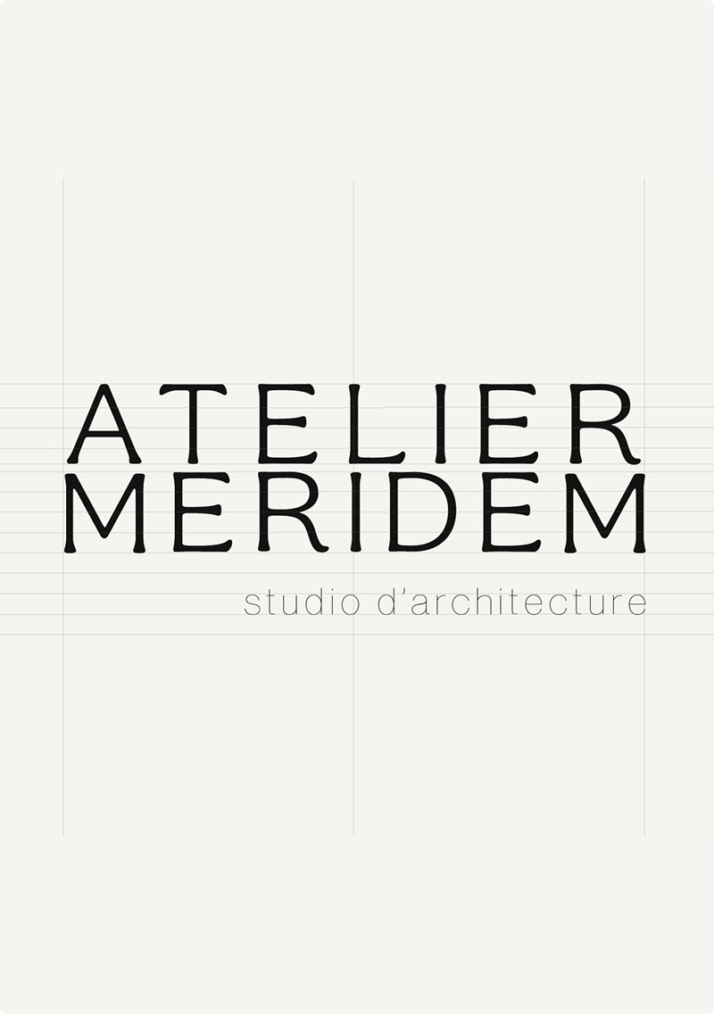
- Typographic-led logo system
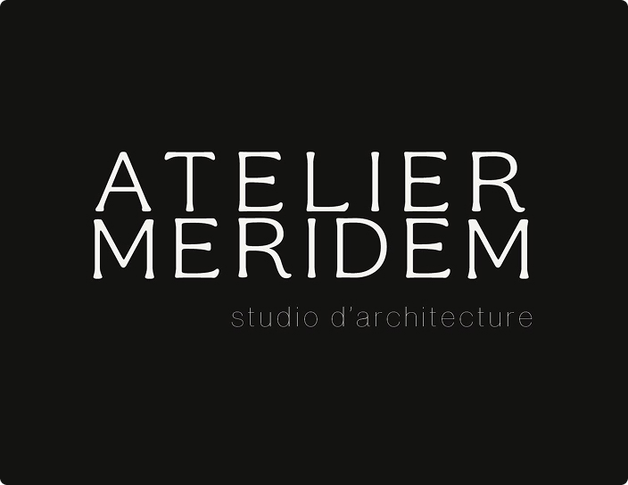
- Colour system — near-black, white, single accent
- Grid framework aligned with architectural proportion
- Editorial and digital application rules
- Brand guidelines
OUTCOME
An identity system that positions Atelier Meridem as a studio where design intelligence begins with the brand — not just the building.
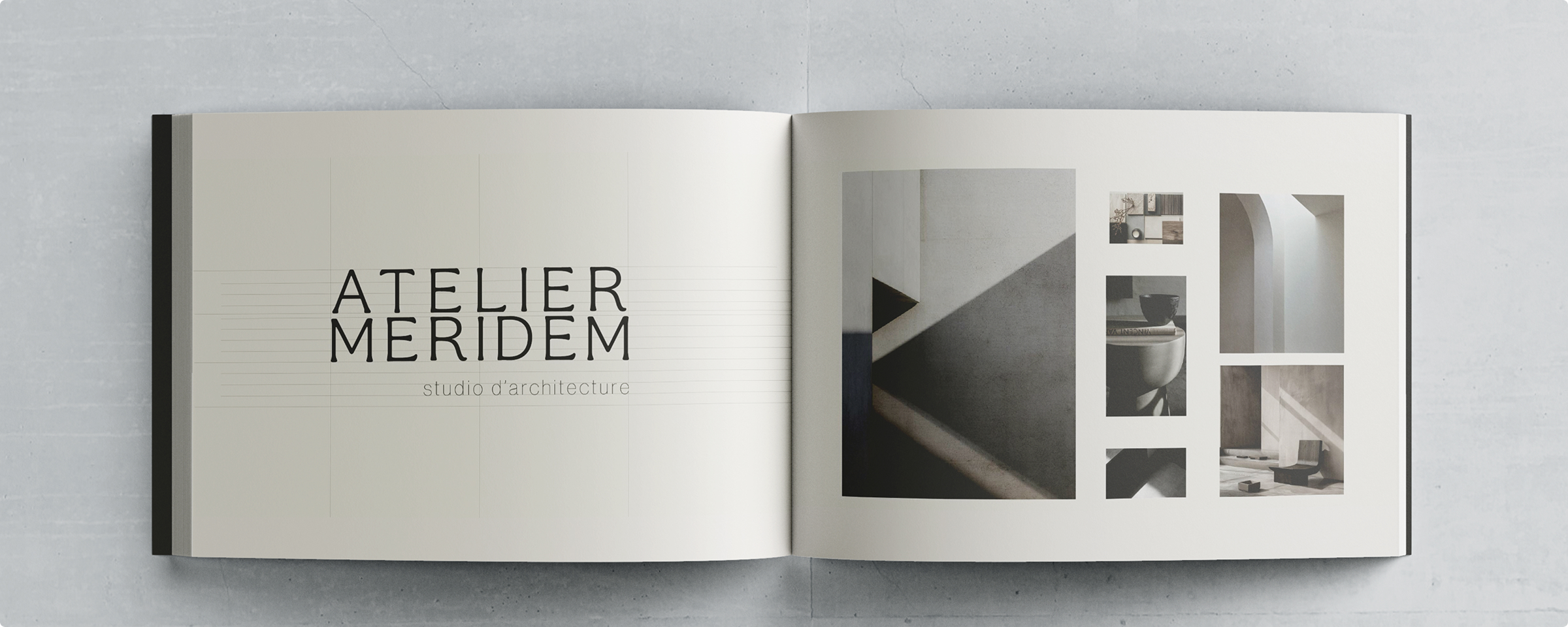
The studio now presents a cohesive identity across project documents, client pitches and digital touchpoints.
PROBLEM & GOALS
The challenge was to build a visual identity as rigorous as the studio's architectural practice.
ROLE & CONTRIBUTIONS
As lead brand systems designer, I defined the typographic architecture and spatial logic, and directed the full production of all brand assets.
WHAT YOU RECEIVE
What you receive
Not just files — a complete system, ready to scale.
Every engagement includes all of the above. Scope defined upfront — no surprises.
Ready to build a system for your brand?
Book a 30-min call